Hacker Newsnew | past | comments | ask | show | jobs | submitlogin

Is this guy why every metal band logo looks like a bundle of twisted sticks? Or maybe he’s just particularly successful at it.


This style is mainly used by black metal and death metal bands, not every heavy metal one.


no, he's just part of a long evolution of metal logos from the 1980s, particularly Mayhem: https://www.metal-archives.com/bands/Mayhem/67

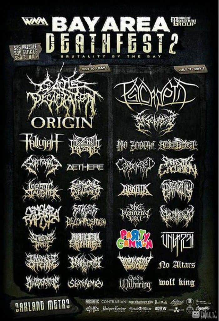
this article kind of glances on Christophe's Emperor logo, which was 1994, but it was also just part of the chain of influences


People seem to like the style but I find them virtually unreadable.


Same here. I think they look kinda neat, but I can't read them to save my life.


The obscurity and inaccessibility is kind of the point, at least for some of the Black Metal bands.


Guidelines | FAQ | Lists | API | Security | Legal | Apply to YC | Contact

Search: