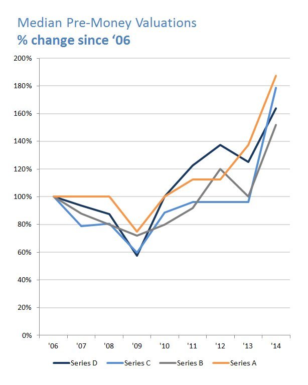
A good data analysis lesson here: Make sure to use multiple Y axes if you are compared line graphs like this.
It is much easier to see the differences at the top of the scale than at the bottom of the scale, but that doesn't mean the shapes of the lines aren't similar if scaled properly. In fact somebody in the comments has made a version with the Y axes normalized, and the shape of the graphs are all pretty much the same, completely contradicting the conclusion the author makes (or if not, the author didn't provide enough clarity on the point he was trying to make).
Classic example of "not challenging your own data" [1]. A tough skill to learn when doing data analysis, because it isn't fun spending a lot of time and effort to try to prove yourself wrong.
Great analysis. A post I wrote recently[1], called "Use percentages" reinforces exactly why your post and Tim's comment are important. Absolute values, especially where some are growing more exponentially than others, will always mislead the human eye.
In any stock market chart for 5+ years, the Y axis should be log-scale. The stock market tends to go up exponentially over time. If you don't use a log scale, then old prices look flat while recent changes are distorted.
Notice how, on the linear scale, the 1987 crash looks like nothing, but on the log scale, it's obviously one of the biggest dips.
The OP makes the same error. Private equity valuations go up exponentially over time for the same reason that the stock market goes up exponentially over time. Since his time horizon is more than 5 years, the Y-axis should be log scale. He's artificially exaggerating more recent gains by using a linear scale.
Also, with a log scale, he wouldn't need to use a different chart for seed/A/B/C/D.
Are they? If markets were rational and efficient, you wouldn't have stocks trading below their asset value. There is nothing rational at all about having $1B on the books that you could acquire for the company in a fire sale, and then trading as though you only have $500M. This is the basis for how value investing works and how people like Ben Graham and one of his students you may have heard of (Warren Buffett) have made billions of dollars off of this assumption. Fred's a great private/venture investor, but he's not a credible source on macroeconomic theory.
Actually that can be entirely rational. When shareholders believe that management will run said assets into the ground, they value a company under book (asset) value.
If I have two hundred dollars in my pocket and without you knowing anything else, you might assess my value at two hundred dollars. However, if I had a thousand this morning and I'm standing at a slot machine with no sign of giving up, you'd probably think my $200 are on the way out.
Given how blatently obvious this "irrationality" is, either a lot of people with enough money to do something about that are being really stupid and missing the huge blinking FREE MONEY sign even though it seems their primary purpose in life is to search for free money, or you're not fully accounting for all the costs involved in extracting the putatively free money, and in fact the market is trying to tell you it's not as easy as it looks.
This is just begging the question. "If the market weren't rational, all these highly rational rich people would take advantage of it, therefore the market must be rational."
Just because the market is "irrational" does not mean that your diagnosis of the irrationality is correct. It is not a binary thing. There's an infinity of ways to be irrational, and most of them are incomprehensible... not the sort of "oh my gosh I can't believe how stupid that is" sort of incomprehensible, either, but literally incomprehensible.
The manner in which the market is being irrational, distributed across millions of actors, many of them greatly more informed than you or I, is all but certainly a rapidly-shifting irrationality, a bubbling froth that changes before you stand a chance of identifying it and taking advantage of it.
Market irrationality probably does not look like a sign hanging out the door saying FREE MONEY, stable for months and years at a time, that mysteriously people are just too stupid to walk up and take. If people aren't claiming their free money, there's probably a reason you don't know about.
(A lot of people desperately need the market to be "irrational" so they can justify putting central authorities over it. But it's really a crazy argument... "the market consisting of millions of entities with all sorts of differing needs and information moving at the speed of electronic data transfer is sometimes "irrational", even if we can't demonstrate that we've correctly identified the "irrationality" by simply profiting from it directly. So let's fix that by putting an entity in charge of it that has a vanishing fraction of the computational power, tiny fractions of a percent of the information, moves at the speed of Congressional deliberation, and has its own independent incentives that do not necessarily align with any participant in the market." The F1 racers are moving too fast, let's send that sloth out to catch them and make them slow down. Surely that will fix racing for everybody.)
Yeah, that statement is pretty loaded, the subject of dozens pf PHD dissertations alone.
I do think Fred is right, but it requires looking looking at the EMF in a slightly different way than most people understand it.
The market is 99% efficient. 1% is what could give some traders who have real skill an edge, such as the Warren Buffets and like. Most people would agree the markets are mostly efficient in that the market react to news quickly, and that most people who try to beat the market using a 'system' (fundamental analysis, quantitative analysis, technical analysis, or other) fail to do so.
But my interpretation of the EMH doesn't preclude the possibility that markets can occasionally exhibit inefficient behavior. It's just that the inefficiencies, when they arise, aren't big enough or occur consistently enough to allow the aggregate of firms to beat some 'rate' of return. This rate could be the risk free interest rate or the S&P 500 dividend yield, or some other benchmark. The EMH is predicated upon random-walk theory, in which theoretically any 'walk' is possible, including even a perfectly strait line for a near-infinite duration of time.
Whilst I'm the last person to defend the efficient market hypothesis, it's perfectly possible that the stock price is more representative of the value likely to be realised from a fire sale of a firm's assets than the asset valuations on a firms books, which are at best representative of the value of the assets sold individually under no pressure and at worst are a work of pure fiction to fit a desired amortisation schedule.
I thought Public markets are emotional? The same chart that he is putting (the Nasdaq) with the year 2000 bubble shows pretty much how un-rational the public market is.
I wonder how much of the growth in valuations in the early rounds (given birken/df07's comments) is explained by the "Seed is the new Series A" phenomenon[1].
It's very challenging to make sense of all this. You can say "Series A valuations are higher" but does that mean higher valuations per revenue (or whatever metric), or just that the terminology has changed, or one of several other possibilities?
Public markets are rational. Tech stock performance has been strong but is driven by strong revenue growth and good business fundamentals generally speaking.
I agree completely. That right there is worthy of an article. Fitbit went public two weeks ago and has a PE ratio of only 25 right now, and that is after a 30% pop in price. If this were the 90's it would have gone public with a PE of 300 or some crazy high number. Despite the high prices, markets are much more sober. I'm rationally optimistic.
We should consider the fact that Fitbit is a hardware company. I say this, because if you look at the recent software IPOs (say Box, Hortonworks, etc.), they have inifite PEs because they are unprofitable.
Low interest rates -> search for yield by institutions -> increase of flow of funds into riskier assets (PE / VC / junk bonds / developing nation sovereign debt) -> "cheap money" for later stage funding.
This contrasts sharply with 1980's VC where capital was much more scarce and thus VCs were able to command more equity for less money put at stake.
From the first chart, data is only aggregated yearly, Median Series C funding only spiked for 1 year (2014). That's not enough to establish a trend, and it's misleading when you compare to the Stock market chart which shows the data trending more continuously.
This discrepancy could be driven by the private equity brand craze. Firms buy into the Uber's, Airbnb's and Slack's at irrational prices just to say the are 'investors' when raising the next pool of money.
It is much easier to see the differences at the top of the scale than at the bottom of the scale, but that doesn't mean the shapes of the lines aren't similar if scaled properly. In fact somebody in the comments has made a version with the Y axes normalized, and the shape of the graphs are all pretty much the same, completely contradicting the conclusion the author makes (or if not, the author didn't provide enough clarity on the point he was trying to make).
Classic example of "not challenging your own data" [1]. A tough skill to learn when doing data analysis, because it isn't fun spending a lot of time and effort to try to prove yourself wrong.
1: http://danbirken.com/statistics/2013/11/19/ways-to-make-fake...