Ugh. We don't have an entirely clear picture of how our eyes physically detect color, much less how we perceive it, but there are serious problems with the argument the author makes here. You cannot simply take a color photograph of a scene, split it in to three channels, then point out that the blue channel is "dark and contains less detail" as evidence of our inability to perceive the color blue. The fact is that the blue channel really is darker because of the actual lack of blue light in the photo.
The trick here is that the areas that have a lot of detail (her face, for example) contain less blue. If you use a color meter to inspect the areas around the girls face, you'll find that there is less blue light present. That makes sense, considering that our skin doesn't contain a lot of blue pigment. This fact is exacerbated by the fact that the author overlaps the channel samples in a way that places emphasis on the areas impacted the most.
Basically, the author fails to understand the additive color model. We don't notice the pixelation of the blue channel in this photo because the result of the alteration is to introduce a low-contrast color in to the photo where the aberration overlaps: yellow. If you look closely, you'll see that the areas where you see cyan and magenta in the red and green channels are replaced by yellow in the corresponding blue channel alteration. The effects are diminished by two factors: there isn't much blue luminance present to influence the other colors, and yellow contrasts poorly with most of the colors in the photo where we notice it (the hood is white).
If you were to take a color-neutral photograph and split out the RGB channels, you'd perceive the same level of detail in all channels.
EDIT: I'd kind of like to take back that last statement about perceiving the same level of detail in all channels. I don't know that you would, but that's not the primary thing that bugs me about the author's argument. My main point is that his argument is flawed, not his assertion. I don't know enough about human color perception to make that argument.
This shows up in the Red-vs-Blue battle analytics in both Halo and Team Fortress 2 --Blue wins measurably more often because they are harder to focus on. Red-vs-Green would be more fair, but that would screw over the large male population with Red-Green colorblindness.
This is why the standard conversion of linear RGB to greyscale is 30%red + 59%green + 11%blue. 33% each would make the blue seem to have too much influence after conversion. This is why BluBlocker glasses make the world seem more sharp. It's why I try to minimize blue in my IDE color schemes.
If you are designing a purely pragmatic UX that requires seeing fine details, I'd recommend a yellow-on-black color scheme with some green and little blue. The classic green/amber terminal screens of yore were ugly, but effective.
> Human eyes are much less sensitive to details in blue compared to green and red
IIRC our strength with green is why many night-vision systems use only green. It has other benefits such as not killing your night vision, but when you take the darkness of the night and remove the red and blue components, you can see better. Once again, IIRC.
Furthering this, I've also read (but can't cite off hand) that it's evolutionary.
A good chunk of the world is green, ripeness of fruits and vegetables can be determined at a distance by detecting green, and moonlight reflecting off of stuff will likely be green more than other colors, enabling the cones to do some of the night vision work besides the rods. Conversely, the only major blue things in nature tend to be the sky and flowers, neither of which provide a significant survival advantage. Interestingly, some women may actually be tetrachromats, giving them incredible ability to differentiate reds.
Also...I can't recall the exact reason, but we have trouble focusing on blues as well (wavelengths maybe?). If you have one nearby, one night go park near the middle of the lot of a Petsmart, which has a bright red/blue sign. Look at the sign while moving your head left and right, the blue letters will appear to move while the red remain stationary.
This caught up with me once as a young teenager; I was driving home on Halloween (totally sober) and I completely didn't see a stoplight. The red just blended in with the darkness.
No, you can't just split a picture into three channels and say "Hey, blue looks dark," because blue might actually be dark.
You can, however, make a picture grayscale, then turn that same grayscale picture into redscale, greenscale, and bluescale. The luminance would be exactly the same for every pixel, the only difference would be the pixel's color.
We do have a clear enough picture of how our eyes work to know that the blue receptors are far fewer than the red and green receptors. Your eyes suck at blue. My eyes suck at blue. All of our eyes suck at blue.
Every time this story comes up, someone brings up this point. That's why I did it right: so I could reply to arrogant comments like yours that assume because an experiment is flawed that the theory it tried to prove must be wrong.
In particular, I'd like to draw your attention to the CIE 1931 chromatic diagram in the wikipedia link. This is supposed to represent the visible spectrum that the eye can see. The triangle is the sRGB colour space, what your monitor can reproduce. Notice how little blue the triangle contains? This is why your blue image looks so dark.
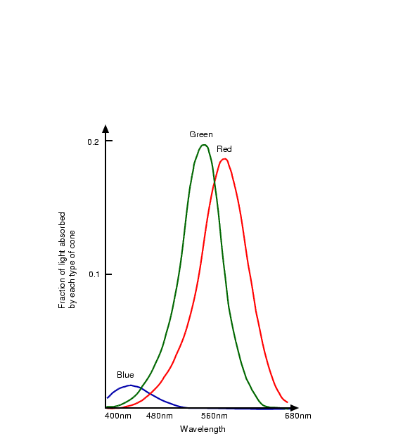
From the second link, it also turns out that CIE 1931 actually underestimates blue sensitivity. The book chapter discusses a corrected version called CIE 1978. It also has a plot of the eye sensitivity to various wavelengths. It turns out that our eyes are about as good at both blue and red, but more sensitive to green and yellow.
Experimentation is difficult. There are often a lot of factors you need to consider. Also, may I ask that you be a little less confrontational in the future? It's quite unnecessary. The majority of people here have good intentions.
edit: upon further research, it turns out it's even more complicated than just the sensitivity and cone numbers. Here: http://hyperphysics.phy-astr.gsu.edu/hbase/vision/rodcone.ht... it states that we should still have less sensitivity to blue. However, we do perceive it to be the same intensity despite this. It appears that we do have difficulty determining details from blue objects, though. The reason is that most of the blue receptors are on the outer areas of the retina. It is a complex topic apparently.
I edited my post within 15 minutes of posting, because I re-read it and realized that it came across that I was challenging the assertion that our eyes are less sensitive to blue. A fact I wasn't sure of either way (but have since learned the facts about). See tensor's and corysama's excellent posts below that contains some great links.
I said plainly in my edit, "My main point is that his argument is flawed, not his assertion." No need to get snarky.
Anyone curious about how I know there is less blue in the photo should open the photograph in an image editor and inspect the histogram for each channel. If you don't understand color histograms, read my dandy article on the topic:
Here's a little experiment that I did.
http://punchagan.muse-amuse.in/blog/do-our-eyes-suck-at-blue...
I tried swapping channels, to cancel any unsymmetric effects like the use of Bayer filter etc. And still I find that the Green channel is always the most pixelated. The difference between Red and Blue channels is not all that perceivable.
Lots of text there, and you certainly sound confident, but I tried an experiment, and it confirmed the claims of the article.
I used Paint.NET, loaded in an image, copied it to three layers. Adusted each layer to be a single colour channel, then changed each of the layers to 'Additive' mode.
Pixellating the blue layer - I could perceive at most some 'colour blotching', but no real loss of 'sharpness'
Pixellating the green layer - pixellation was easily visible.
Pixellating the red layer - the effect was somewhere in between.
You should give it a try. Here's my test Paint.NET image file with the layers all set up for you:
The additive color model isn't exactly the same as the layer modes you'll see in image editing apps. This "mode" affects how the values of the current layer are applied to the layers below it. The normal mode is to replace the values below. When you switch to additive, the RGB channels from the current layer are "added" to the values of the layer below. This is entirely different than the concept of the additive color model.
There are two broad color model types: additive and subtractive. Additive color models (like RGB) "add" color to arrive at white. Subtractive color models (like CMYK) "subtract" color to arrive at white. In the RGB additive color model, we most frequently refer to the primary colors, RGB, but the secondary colors (cyan, magenta, and yellow) are equally important. The primary colors are the result of raising only one channel to full luminance while all the others are at zero. The secondary colors are produced by raising all channels to the maximum, then dropping one channel to zero. The secondary color for the blue channel is yellow.
The consequence of this is that you can't simply pixelate the blue channel in an additive model RGB image and claim this proves a lack of ability to perceive color in the blue light spectrum, because the alteration of the primary color will inevitably affect the distribution of the secondary color, depending upon the luminance of the other channels in the region.
A better test would display a test pattern in different colors, but matching luminosity. The trouble with testing this on your computer is that your display must be calibrated. On a properly calibrated display, the display of RGB[0,255,0] and RGB[0,0,255] should have identical luminance values. Very few people have calibrated displays, and even if you do, the chances that your display is accurate throughout the color gamut for a given luminance value is even less.
I'm not arguing against for or against that fact. I'm arguing that these "testing" methodologies are flawed. I'm, apparently, doing a very poor job of expressing the distinction.
Let me state in as clearly as I can:
* A good test would ensure that the luminance values for all colors matched exactly throughout the test image.
* Said test would need to be displayed using a device that is calibrated to ensure displayed luminance matches encoded luminance.
* A test that pulls color data from a source image with mixed luminance values in each channel is flawed.
* This statement makes absolutely no claim as to the human ability perceive any of these colors.
The trick here is that the areas that have a lot of detail (her face, for example) contain less blue. If you use a color meter to inspect the areas around the girls face, you'll find that there is less blue light present. That makes sense, considering that our skin doesn't contain a lot of blue pigment. This fact is exacerbated by the fact that the author overlaps the channel samples in a way that places emphasis on the areas impacted the most.
Basically, the author fails to understand the additive color model. We don't notice the pixelation of the blue channel in this photo because the result of the alteration is to introduce a low-contrast color in to the photo where the aberration overlaps: yellow. If you look closely, you'll see that the areas where you see cyan and magenta in the red and green channels are replaced by yellow in the corresponding blue channel alteration. The effects are diminished by two factors: there isn't much blue luminance present to influence the other colors, and yellow contrasts poorly with most of the colors in the photo where we notice it (the hood is white).
If you were to take a color-neutral photograph and split out the RGB channels, you'd perceive the same level of detail in all channels.
EDIT: I'd kind of like to take back that last statement about perceiving the same level of detail in all channels. I don't know that you would, but that's not the primary thing that bugs me about the author's argument. My main point is that his argument is flawed, not his assertion. I don't know enough about human color perception to make that argument.